As a blogger, we are always looking for ways to improve views to our blog posts. Pinterest is a great tool for directing traffic. I haven’t had a viral pin yet and I’m hoping that doing this exercise will help me to see what is performing well, so I can improve on it. One thing I did find is that something was messed up in my posts and my featured image is not showing up like it is supposed to. Now, I have a new action item on my “blog to do” list.
Top Pins and Top Posts
One surprising thing to me is that a pin may perform very well, but that doesn’t necessarily mean it will be a top post. Top pins and top posts are different. Sometimes people pin your pins because:
- they like the look of your pin
- it fits in their niche
- you have a catchy phrase or quote that people like
- content looks intriguing and they may be pinning to view later
Shannon’s Grotto -Top Performing Pins In 2017
We will start with our #1 pin and work our way to #10. By each pin I will talk about the elements I tried to include to make my pins stand out. Here are some tips:
- alt text– so that no matter who pins it, it will have a description
- Vertical Pins– Basically they are longer than they are wide: a rectangle
- I’ve pinned them to my blog board: From Shannon’s Grotto
- I’ve pinned them to other boards where they fit in. For example this first pin: From Shannon’s Grotto, Marriage, Relationships, and Thoughts
- Pin to group boards (make sure you follow each groups rules)
- Apply for and make “rich pins”
- Use the colors yellow and red
- Without faces- for some reason people tend to not pin pins that have a face looking forward, though a profile does fairly well.
#1 Pin 2017
Marriage Rules for a Long and Happy Marriage
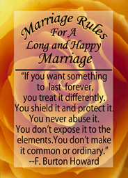
- It is longer than it is wide. (Vertical Pin)
- I used 2 fonts
- It is yellow; I read somewhere that pins with yellow and red tend to perform better
- overlay
- Quote
#2
12 Father’s Day Gift Ideas-for the hard to buy for dad
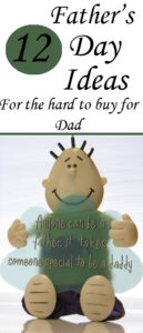
- Long vertical pin
- 2 fonts
- It has a face, but isn’t an actual person
- “For the hard to buy for Dad” draws people in
- List
#3
23 Things You Don’t Understand About My Auto-Immune Child
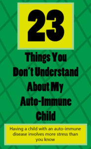
In my Pinterest analytics, this pin ranks high in clicks, saves and more!
- Even though it isn’t very long, it is still a vertical pin
- Has yellow
- 2 fonts and different font sizes
- Title and a little more info
- List
#4
Are You Making Your Marriage A Sweet Love Story?
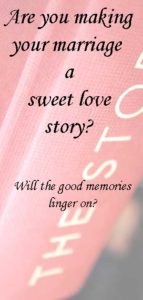
- Vertical pin
- Nice photo with an overlay
- While there are not 2 fonts, there are different sizes of the font
- Intriguing questions
- The color red, even though it is muted with the overlay
#5
Brown Sugar Bacon and Omelets
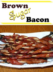
- Tasty picture of the recipe
- 2 fonts
- vertical, but just barely
- contains yellow
#6
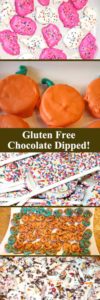
Gluten Free- Chocolate Dipped Goodies
- Multiple images of the things contained in this post
- Multiple information- recipes
- vertical pin (very long)
- Specialized “gluten free”
- the orange and pink catch your eye (variations of yellow and red)
#7
Delicious Turkey, Red Onion, and Goat Cheese Scrambled Eggs- gluten free
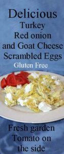
In my Pinterest analytics, which you get with a Pinterest business account, this pin ranks high with being shared a lot as well as: a high mix of saves and clicks!
- vertical pin (long)
- yellow and red
- what the recipe looks like
- specialized niche “gluten free”
- Info about the recipe
#8
Easy Gluten Free Pesto Chicken Served with Alfredo
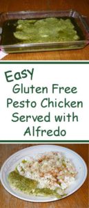
- Vertical (long)
- This is the 3rd popular pin that has green in it. It’s looking like green is another standout color for pins.
- photos of the recipe
- Word choice “Easy”
- Same font but “Easy” is turned to make it a little more eye catching.
- Niche “Gluten Free”
#9
Raising Daughters- What we have learned
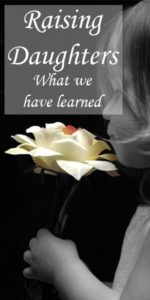
- Vertical pin (long)
- 2 sizes of font
- yellow
- while there is a face, it is a profile and not directly on
- overlay helps to see the words better
#10
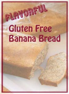
Flavorful Gluten Free Banana Bread
- Vertical (just barely, it is a rectangle)
- picture of the finished product
- red
- overlay
- 2 fonts
- “Flavorful” is turned to be eye catching
- Word choice “Flavorful”
- Niche “Gluten Free”
Something to think about
Doing this exercise has given me a lot to think about as I create my next pins. For example:
- vertical is important (I’m going to keep doing it and size doesn’t seem to matter as long as it is a tall rectangle)
- red, yellow and green have performed well
- different fonts on 1 pin- I should do more of that!
- different sizes of fonts- I should keep doing this
- 6 of 10 of the pictures were my own and I don’t necessarily need to use someone else’s photos
- 1/2 of the top performing pins are food- recipes
- Relationship and emotional pins are performing well
- I did some trial periods for Tailwind and BoardBooster. Would these tools improve my pins performance and can I afford it right now? (Something to consider)




Leave a Reply
Your email is safe with us.